Built Fyndiq's design team and design system; work shipped twice as fast
- Role
- First in-house designer, then Design Team Lead from month 6
- Team
- Grew to 3 designers, me included; I hired the second at month 6. SemlaDS with 1 junior designer and 1 senior front-end developer
- Scope
- B2C marketplace · responsive web · design system, research, search, product page, checkout, order emails
- Context
- Nordic marketplace, acquired by CDON in 2023
- 2x
faster to production per story point on SemlaDS, from sprint velocity data
- 54→73
SUS score for the new product cards, 36 participants
- −60%
support tickets for missing orders, 3 months after the new order email
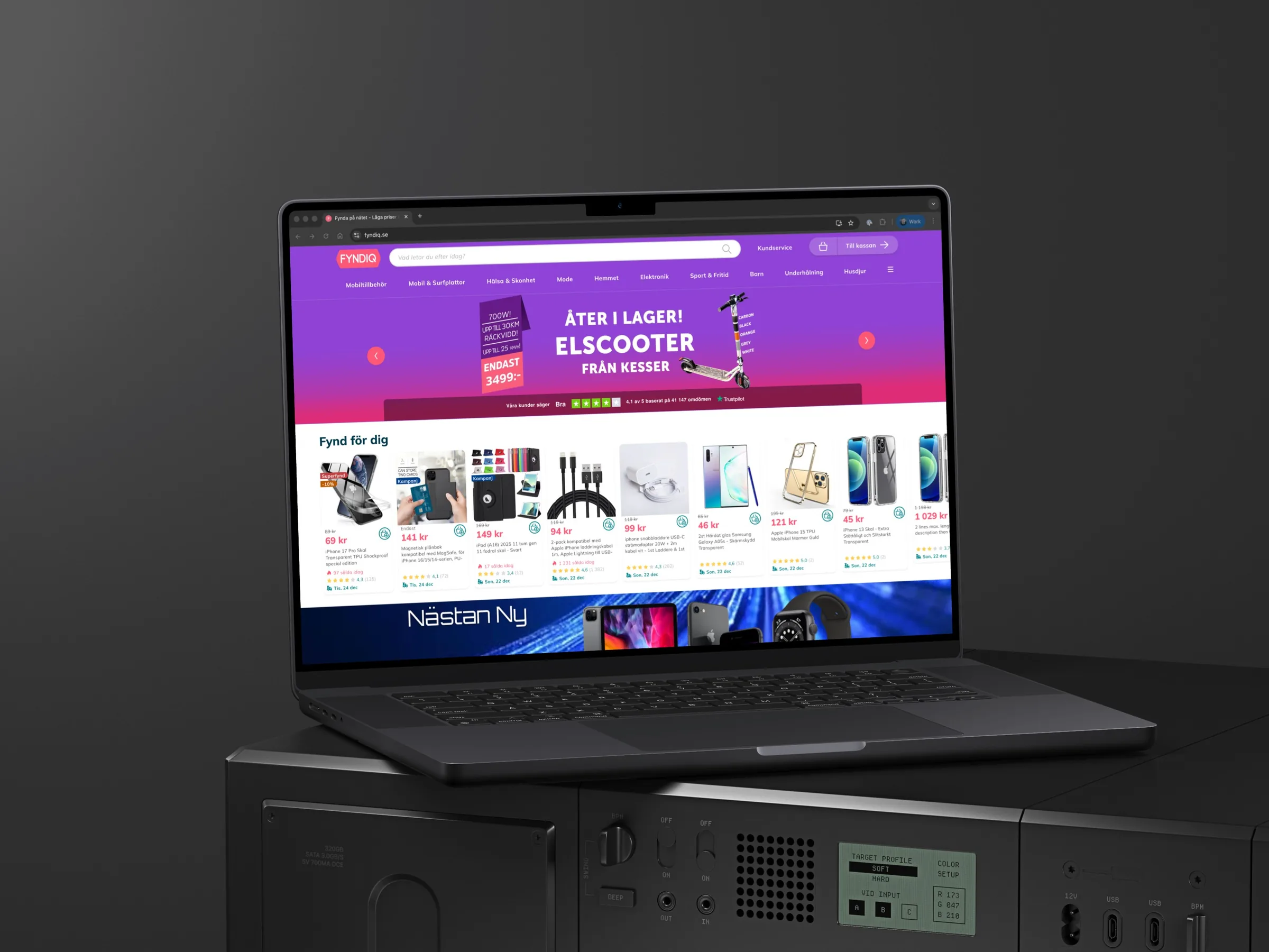
I joined Fyndiq in 2020 as its first in-house designer. Over 3 years I built its design team, design system and research practice, and I designed much of the path from search to checkout myself.
A growing marketplace with no design function
Fyndiq was becoming one of the largest marketplaces in the Nordics. I started with no design team, no design system and no research practice. Engineers made UI decisions on the fly, which slowed releases, and usability was below par: the product cards scored 54 on the System Usability Scale, under the industry average of 68.
My job had 2 parts. Build a design function that product and engineering could work with, and make it easier for shoppers to find, compare and buy.
Design and code on one system: twice as fast to production
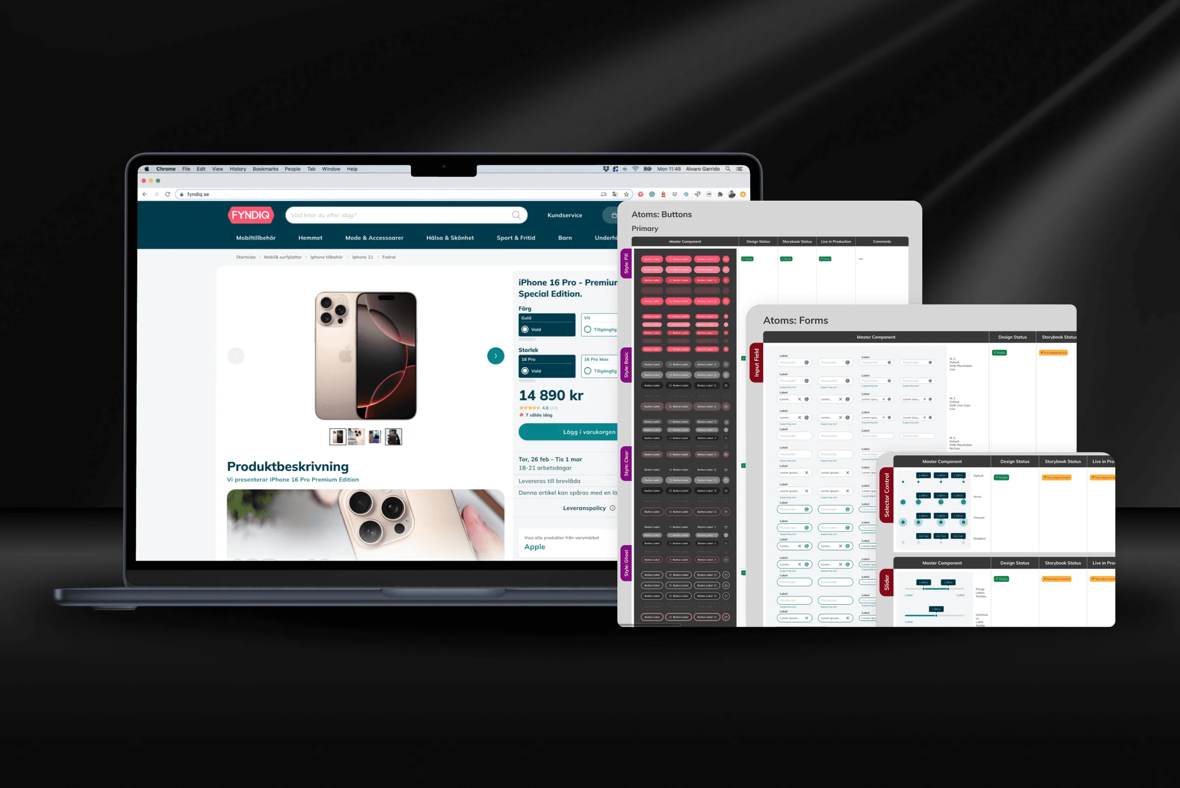
Together with a junior designer and a senior front-end developer, I built SemlaDS, a design system for e-commerce. The choice was one set of components for design and code: the Figma library and the Storybook site stayed in sync, so designers and developers worked from the same parts. We considered adopting an existing UI kit, but a marketplace needed its own e-commerce patterns and its own brand, so we built our own.
The new version of Fyndiq was built on SemlaDS. Work on it reached production twice as fast per story point, measured in the team's sprint velocity data before and after SemlaDS. Fredrik Norberg, CEO at the time, credits the system with helping the front end move forward.
“We were working in tandem developing a design system from ground up. Alvaro was driving the project as our main UX designer.” Alexey Vorobyev, engineer, Fyndiq AB
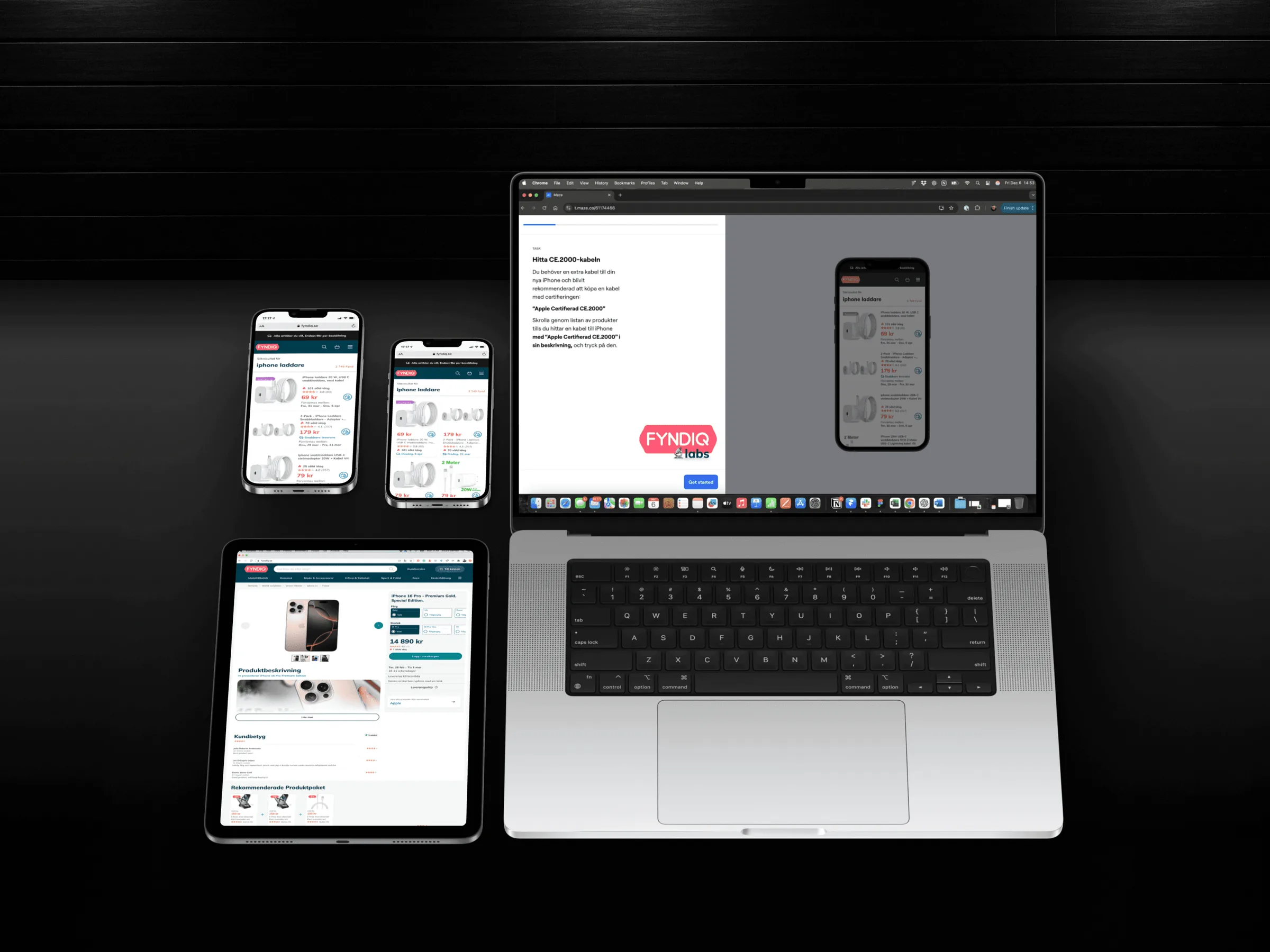
Product cards tested before code: SUS from 54 to 73
I led usability testing with Maze and Figma prototypes, so we could test ideas before anyone wrote code. We studied how shoppers behaved in search results, organic browsing and acquired traffic, then redesigned the product cards. Measured before and after with 36 participants, their SUS score rose from 54 to 73: from below the industry average to above it.
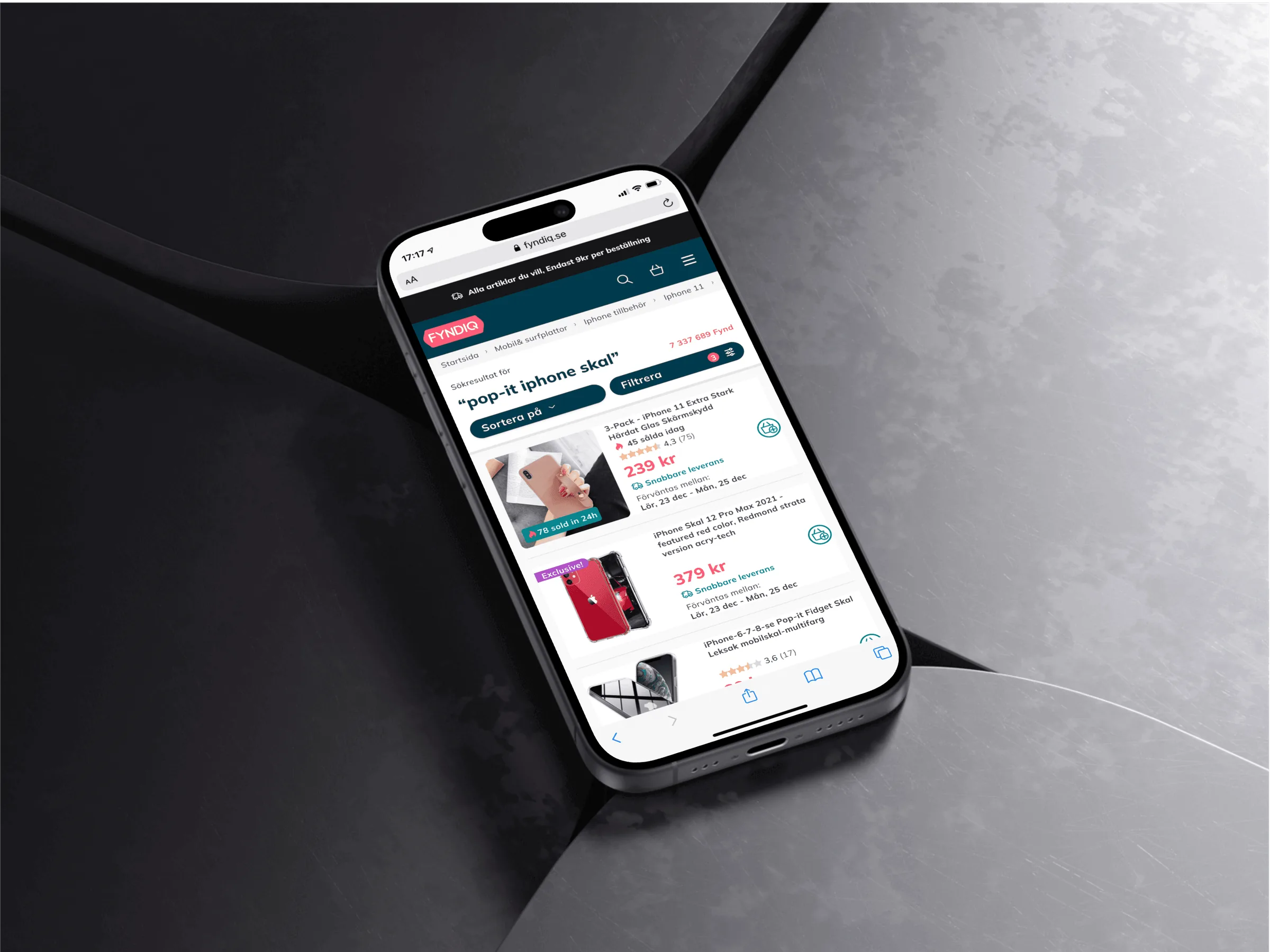
The hardest call was the card's shape. For Search 2.0, landscape cards scored higher than portrait for scanning and comparing, but most teenagers and young adults preferred portrait. They were Fyndiq's new focus: TikTok trends had shown us a way to showcase many products we already sold. So their preference outweighed the scanning scores, and we chose portrait. Portrait shipped on the search results and the home page.
An order email built for split deliveries cut missing-order tickets by 60%
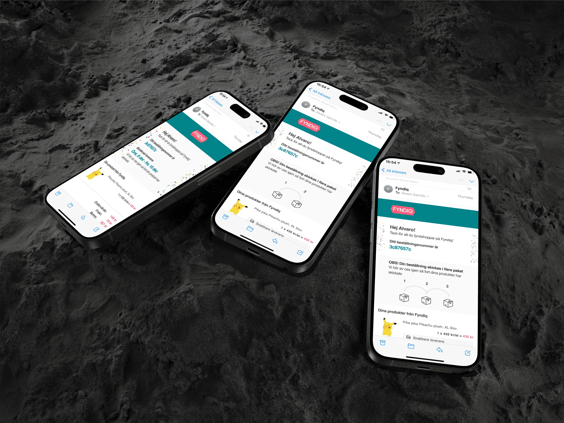
On a marketplace, one order can come from several merchants and arrive in several deliveries. Customers reported orders as missing when only part had arrived. With a junior designer, I designed the second version of the order confirmation email that every Fyndiq customer received after a purchase. It had variations for different cases, such as the number of deliveries in the order.
Support tickets about missing orders fell by 60% in the first 3 months after it shipped.
Less time in search, on the product page and in checkout
The same method, test before code and measure after, ran through the rest of the path to purchase:
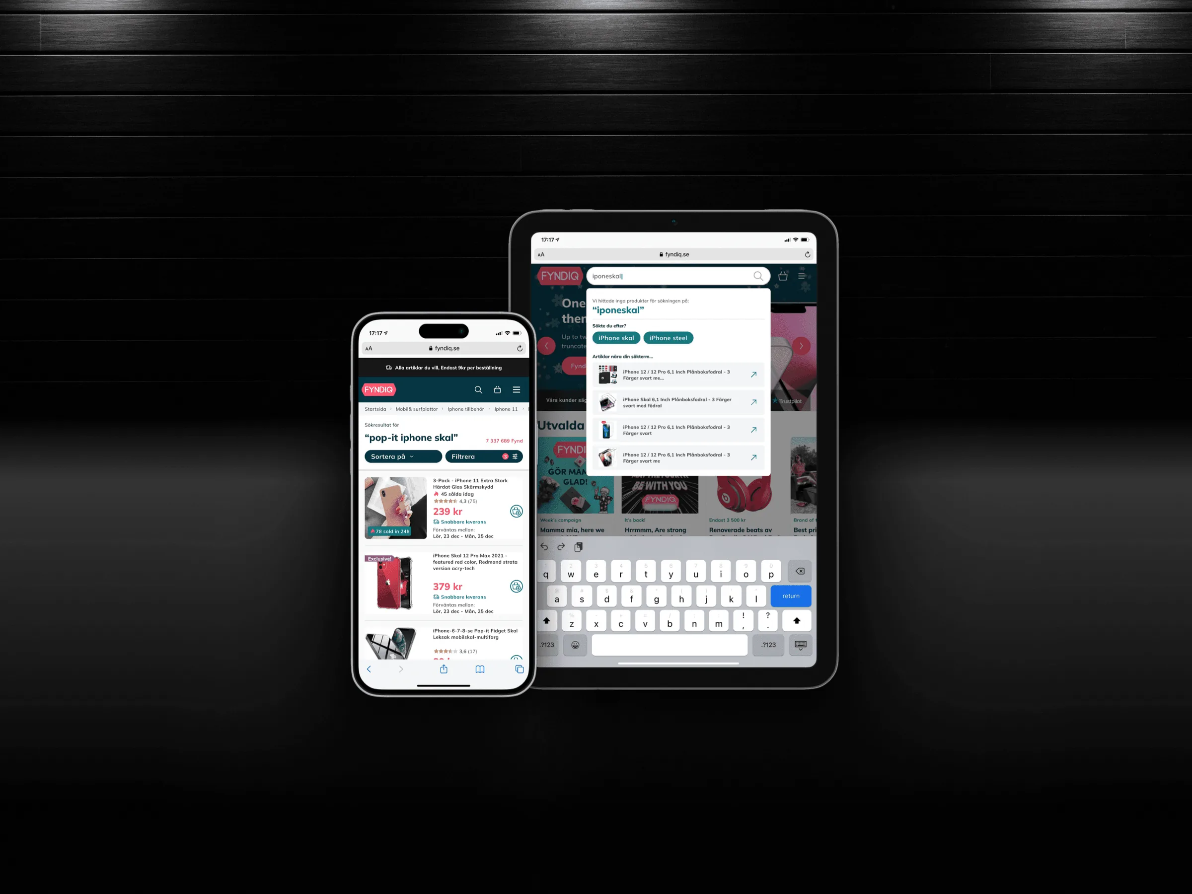
- Search 2.0. I designed every step myself, from the search field to results, filters, sorting and the product page. Time on listings before reaching a product page fell by 50%.
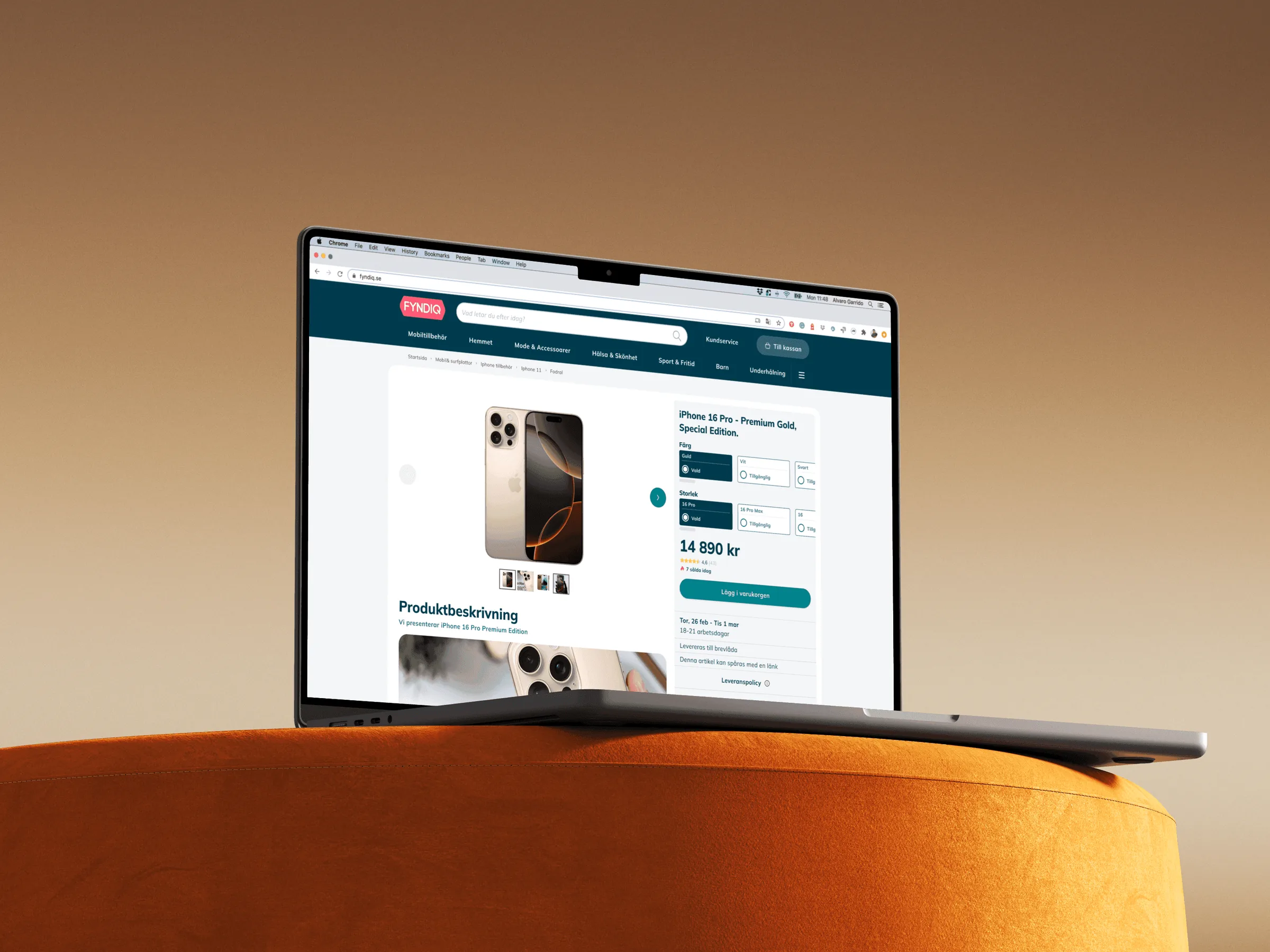
- Product page. I led the redesign with 2 designers. I designed the core components they assembled in their tests: buttons, ratings, variant selectors, images and description blocks. Time to add to cart fell by 10% on average.
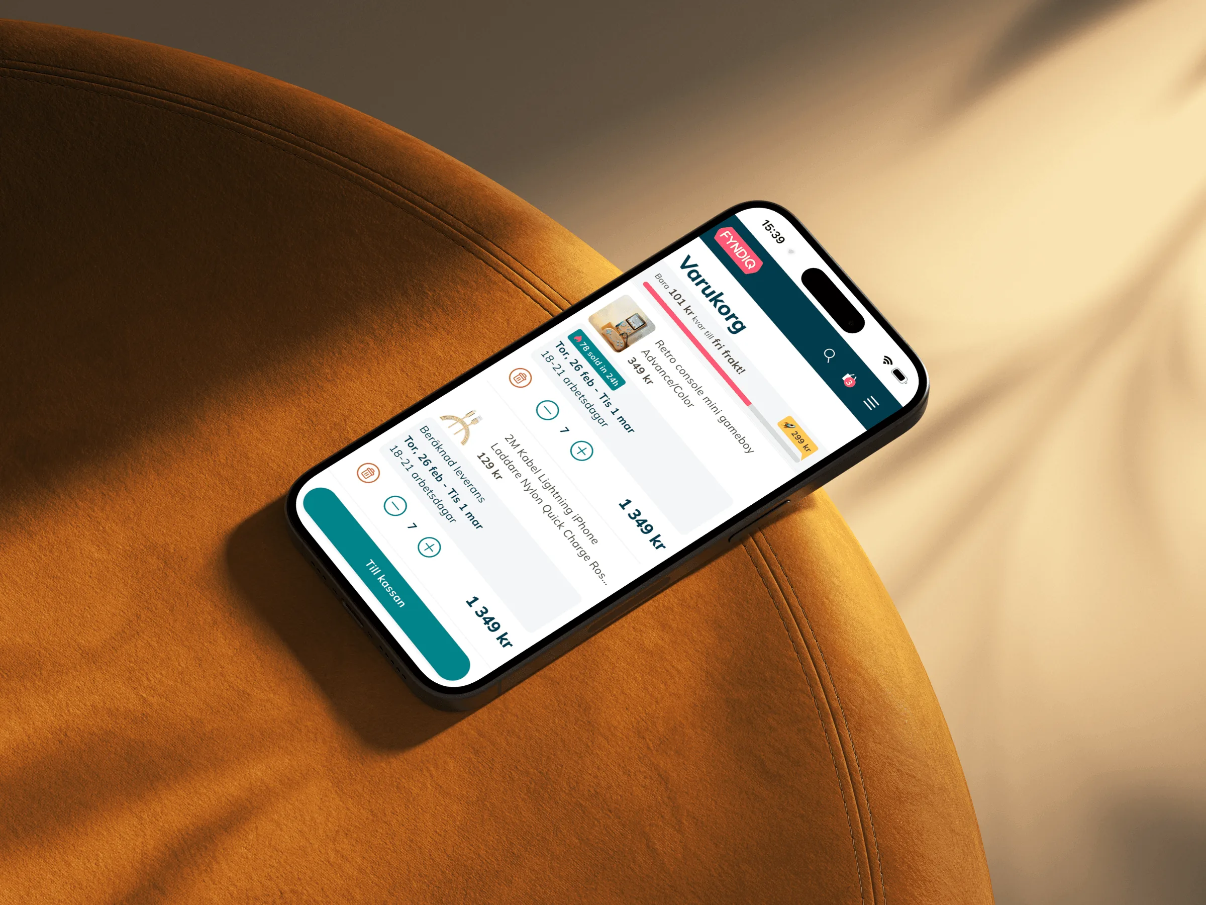
- Cart and checkout. We prototyped a minimal cart, a full-page cart and a gamified cart that let shoppers unlock free delivery. We tested them with developers, stakeholders and customers, and the minimal cart shipped. Time spent in checkout fell by 22%, and conversion held.
- Share your cart. It started at a hackathon, where a front-end developer coded the core in a few hours. We finished it together, and shoppers used it to share product lists from their carts.
All three figures compare analytics before and after launch. None comes from the A/B tests we ran.
From only designer to team lead in 6 months
For my first 6 months I was Fyndiq's only in-house designer. When I hired the second designer, I became Design Team Lead. The team grew to 3 designers, me included.
Beyond the screens, I set up how design worked at Fyndiq:
- UX research for the whole company, both qualitative and quantitative.
- Principles, guidelines and protocols for the new design team.
- DesignOps between design, product and engineering.
- Usability and A/B tests, run with the front-end team and product managers.
“Alvaro has been the guiding force behind Fyndiq's UX design, expertly crafting our UX workflows and engaging the entire company in the process.” Atra Azami, former CTO, Fyndiq AB
What I'd do differently
I'd agree on 2 or 3 metrics with product before the first test. Most of my numbers are before and after, so they show the change but not always what else moved. I'd track SemlaDS adoption from v1, so the 2x had a second number behind it. And I'd hire the second designer sooner: 6 months as the only designer made me the bottleneck between research, the system and delivery.
Credits: a junior designer and a senior front-end developer on SemlaDS, 2 designers on the product page and a front-end developer on Share your cart.